


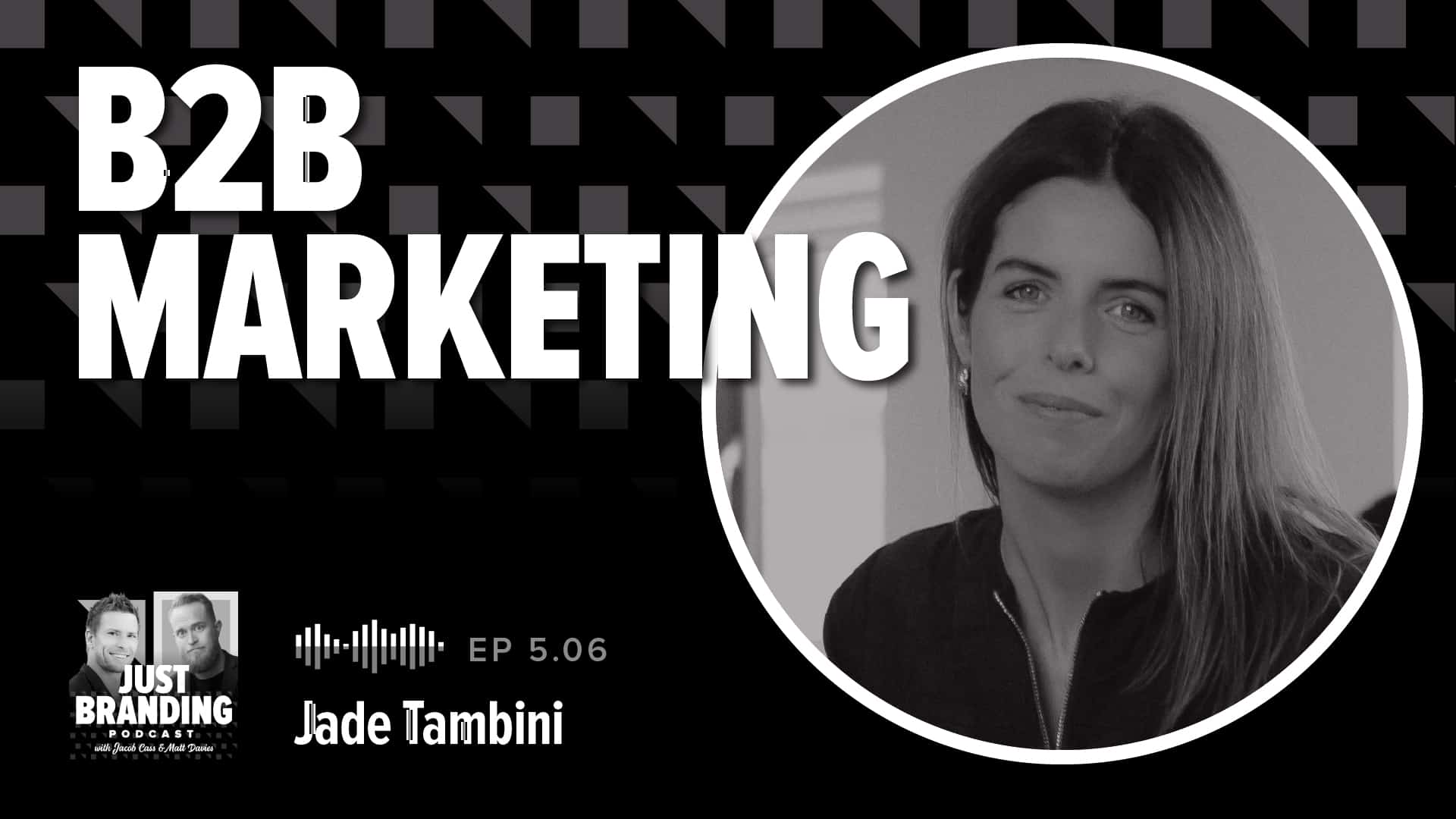
[Podcast] B2B Marketing with Jade Tambini
In this insightful episode, we're joined by Jade Tambini, a B2B marketing expert and course leader at B2B Breakthrough Academy.

Top 10 Design Conferences to Attend in 2024
Design conferences serve as hubs for design professionals to connect, exchange ideas, and gain inspiration. Here are the top 10 to attend in 2024.

The Best CorelDRAW Graphics Suite Discounts: Get 10 to 50% Off (2024)
Save money (10-50%) on CorelDRAW software with these top discounts, sales & deals. See the best CorelDRAW discounts & special offers on Graphics Suite & more.