


The Best Adobe Creative Cloud Discounts & Deals: Get 40 to 70% Off
Looking for Adobe Creative Cloud discounts, sales & deals? Here are the best Adobe CC special offers + how to get a Creative Cloud discount at 40-70% off!
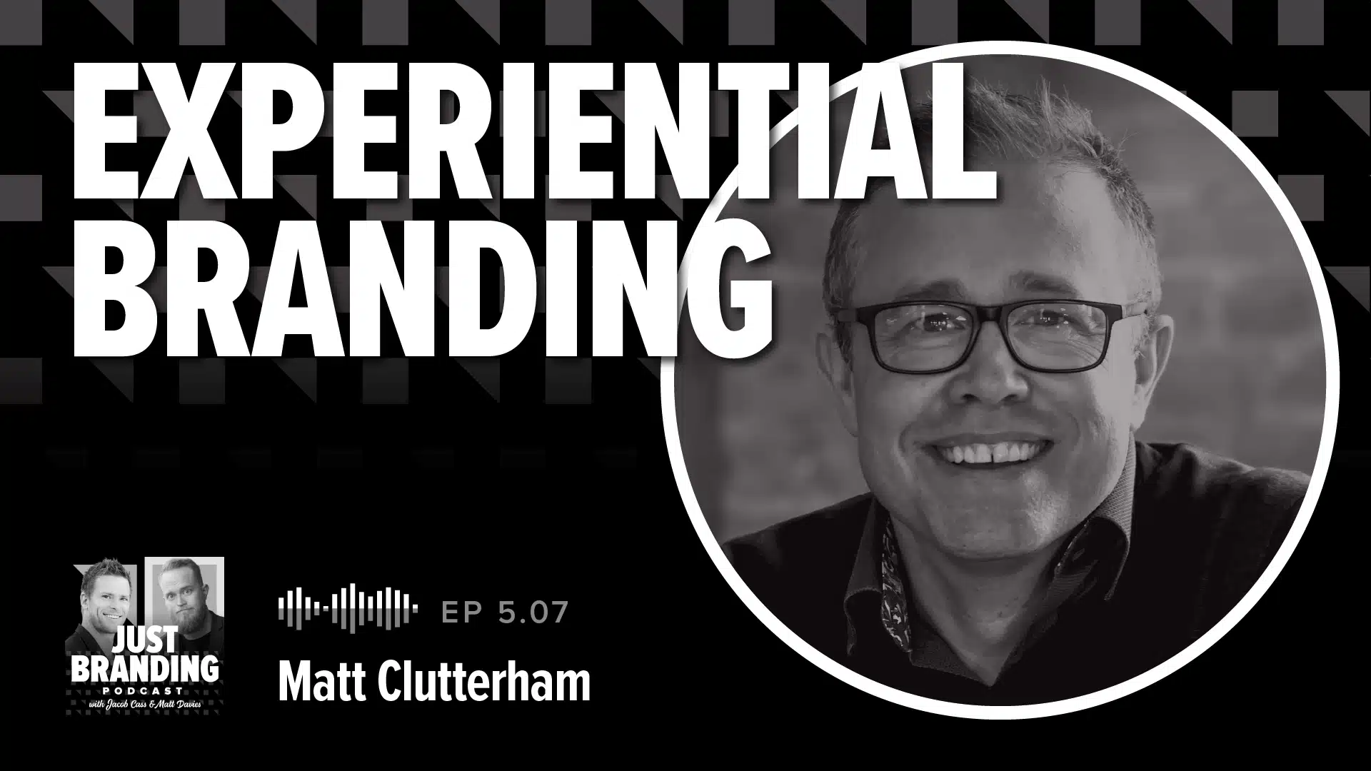
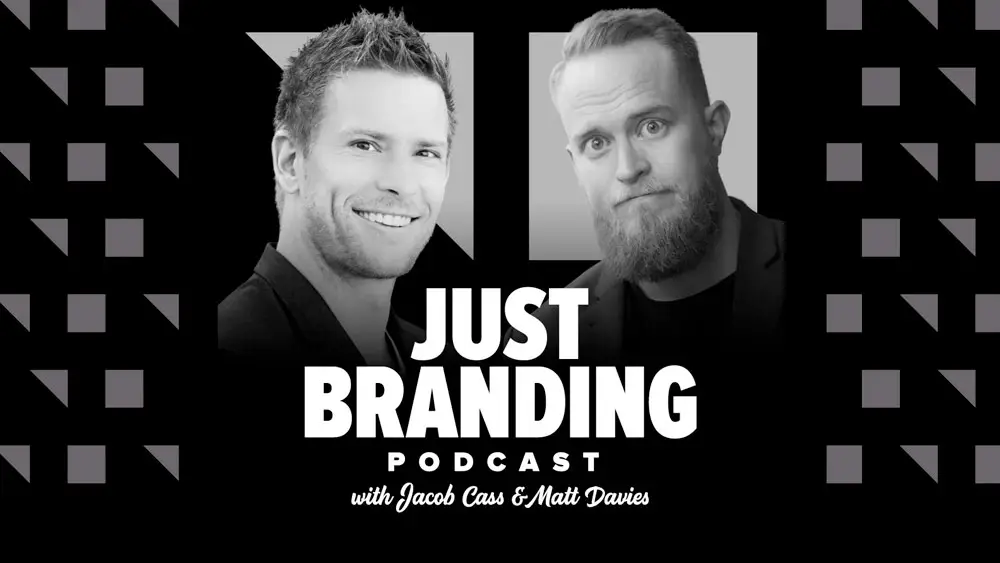
[Podcast] Experiential Branding (Light & Atmosphere) with Matt Clutterham
In this episode we sit down with Matthew Cluttingham who has been creating experiences for global brands for over 20 years.
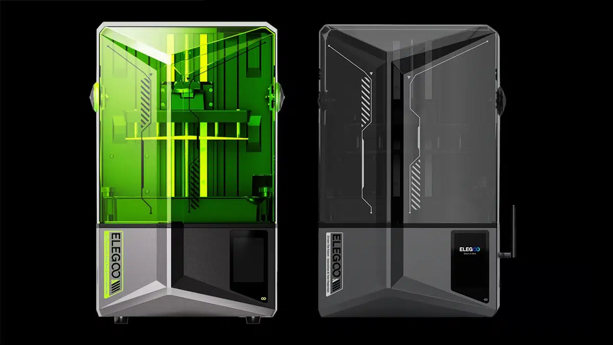
Take Your 3D Printing Experience to the Next Level Together with Elegoo’s Saturn 4 Series
Let me tell you about ELEGOO. Back in 2015, I remember reading about this new company started by a bunch of whizzes from Shenzhen. They were all about creating cutting-edge ... Read more