


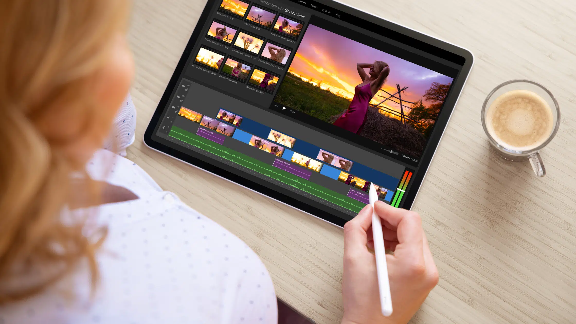
10 Best Tablets with Stylus Pen in 2024 (April)
The days of paper and pencil are long gone. There are new tools and our list of the Best Tablets with Stylus Pen will help you craft a new era!
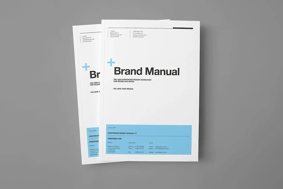
26+ Best Brand Style Guideline Templates for Branding & Identity Design (Free & Premium)
We bring you the 25+ best brand style guideline templates for branding & identity design which can be helpful to jump start your brand's style guide.

10+ Best Monitors for Working from Home in 2024 (April)
The best monitors for working from home are a necessity for any home office. The choices on our list can make getting to work much easier!